
Presenting… Ronald Shakespear
Buenos Aires, Argentina
View photographic images by and of Ronald Shakespear, my southern compañero, here.
Buenos Aires, Argentina
View photographic images by and of Ronald Shakespear, my southern compañero, here.
Buenos Aires, Argentina
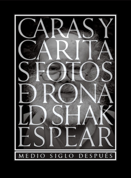
This week, a lovely little cloth-bound book of photographs arrived at my studio, Revisiting the Sixties by my long-time friend Ronald Shakespear. You can see more of his eclectic collection of images in an exhibit (PDF) here, or flip through the book online (via issuu) here.

«One day in 1964, I took a plane to Spain to go see Orson Welles, who lived near Juan Perón in Puerta de Hierro. I knocked on his door, without an appointment, and was surprised that he opened the door to me — it did not matter that I had arrived “just like that.” There he was, the great Orson, washing down an old Buick (which never actually ran). The fact that I had no appointment mattered not at all: “Never ask permission,” he said, “Never.”
That cemented my admiration for him. He invited me to the Plaza de Toros in Madrid, I spent a lovely afternoon and took some pictures that I still love. We spent an unforgettable afternoon watching the master bullfighter Curro Giron… then we went to the Plaza Butchery (to buy meat) and Giron gave the bull’s ears to Orson.»

Ronald Shakespear has accomplished what only a few chosen ones do: a total work of art, his own life. As he would say, let us draw a compassionate veil on the long years of our friendship… and throughout those long years, I do not remember him ever stopping to rest, ever taking a break from his multi-faceted creative endeavors that have brought beauty to all things around us, by adding colour to the existing grey. And that includes his photographic work, one of his many talents, where black and white give his touching images the importance of being a precious document of his world and ours.
—Edouard Golbin, Photographer (Paris)

Ronald’s photographs are, first and foremost, photographs. They are pictures of light falling unto things and somehow discovering (and covering) them: direct, strong, bold, more shadow than light. The subjects come later… They are all a self-portrait, a portrait of intensity as a photographic theme. Once again, it’s all Ronald: that is how he talks. That is his language. Those are his signs. Frontal, straightforward, no beating about the bush. Why should his photographs be any different?
—Jorge Frascara, Icograda Past President (Padova, Italy)

Narrative talent is a constant in the work of Ronald Shakespear… “Revisiting the Sixties” is flooded with a poetic yet earthly presence that can be seen in every single portrait. Ronald’s eye is a lens that encompasses all the senses and enables us to share into that intimate, personal world, not only through our eyes, but also through that which is beyond our eyes.
—Marcelo Ghio, Dean, Isil University (Lima, Perú)

Today, we know Ronald Shakespear as a designer with a wide portfolio of celebrated identity and environmental graphics projects. But in the 1960s, one of his primary modes of visual expression was portraiture, harnessing black and white photography to capture friends and celebrities in intimate moments. In his book “Revisiting the Sixties” he shares these photographs again — and today, with the benefit of time and the breadth of his design career, we can appreciate the threads that tie these photos to the rest of Shakespear’s body of work. Like his most successful logos, these portraits are simple gestures and yet they are iconic in their ability to communicate a great deal within a modest format.
—Leslie Wolke, Writer (Austin, Texas)

Buenos Aires, Argentina
The Society for Environmental Graphic Design (SEGD) has honoured Ronald Shakespear, founder and principal of Diseño Shakespear Design Consultants in Argentina, with the 2008 SEGD Fellow Award. Ronald is an internationally acclaimed designer and the “father of environmental graphic design in Argentina.” Diseño Shakespear is an award-winning design firm specialising is the planning and design of signage, wayfinding, and identity programs for a wide variety of facility types, including the Buenos Aires Underground (Subte), Municipal Hospitals, Buenos Aires Signage System, Temaiken Zoo and many more.
SEGD Fellows are selected for promoting the highest values in environmental graphic design, and significantly contributing to the direction and growth of the field. Past SEGD Fellows include Garry Emery, Robert Venturi and Denise Scott Brown, Lance Wyman, Ivan Chermayeff and Tom Geismar, Deborah Sussman and Massimo Vignelli.
Congratulations, my friend!


Buenos Aires, Argentina
Congratulations are in order for my friend Ronald Shakespear, who makes not infrequent appearances here on this blog—he’s just hit 69! (Not to worry, old man… soixante-neuf is a fine number indeed).
Painting by Andrew Lewis… with some help from Michelangelo.


Buenos Aires, Argentina
Back in the 1960s, my good friend Ronald Shakespear was also something of a photographer—a collection of his images were published in the book Caras y Caritas, and he’s shared some of his reminiscences in a blog posting (from which I’ve paraphrased the following snip)…
One day in 1964, I took a plane to Spain to go see Orson Welles, who lived near Juan Perón in Puerta de Hierro. I knocked on his door, without an appointment, and was surprised that he opened the door to me—it did not matter that I had arrived “just like that.” There he was, the great Orson, washing down an old Buick (which never actually ran). The fact that I had no appointment mattered not at all: “Never ask permission,” he said, “Never.”
That cemented my admiration for him. He invited me to the Plaza de Toros de Madrid, I spent a lovely afternoon and took some pictures that I still love (even though the originals were lost by Atlantis magazine after they were published). We spent an unforgettable afternoon watching the master bullfighter Curro Giron… then we went to the Plaza butchery (to buy meat) and Giron gave the bull’s ears to Orson.
Above images (all photos by Ronald Shakespear): film director Orson Welles (1915-1985) in Madrid, 1962; Argentine writer Jorge Luis Borges, (1899-1986), already blind at the time of the photo, in Mexico, 1964; Argentine jazz pianist Enrique “Mono” Villegas (1913-1986) at a friend’s house in BA, 1964. The book cover of Caras y Caritas, design by Rubén Fontana.

Córdoba, Argentina
A portrait of (Ronald) Shakespear has mysteriously appeared in the form of anonymous grafitti on a park wall in this central Argentinian city, where the veteran designer was recently invited to talk to students. Says Ronald (quoting MacArthur): “I came through, and I shall return.” We don’t doubt it my friend, we don’t doubt it—though even the finest images can be fickle, and a pipe is not always a pipe… :-)
(Thanks to Ronald Shakespear for the quote).


London, UK
In 2010, Fletcher Studio was set up by Alan’s daughter, Raffaella Fletcher, to manage the archive of her famous father’s work. The archive is now online, and Raffaella has given me permission to post some samples of Alan’s work here… please note that everything shown here and on the website at alanfletcherarchive.com is protected by copyright and other intellectual property laws and treaties around the world.
View much more of Alan Fletcher’s beautiful graphic design work (and descriptions for the images shown above) here.
Thanks to Ronald Shakespear, a mutual friend from Argentina, for bringing the Alan Fletcher Archive to my attention.

Buenos Aires, Argentina
(translated from an article by Marina Gambier for La Nación)
Over the last 50 years, Ronald Shakespear and his team have made their mark on the city: almost everything that you see in Buenos Aires is their work, from street names to signage at hospital maternity rooms.
From behind the counter at her candy store, “Los Tres Soles,” Gladys answers the same question fifteen times a day: “Excuse me, Madame: Is this street Bonifacio? Where is Calasanz? Is it that way?”
“You are now at the corner of Bonifacio and Calasanz,” answers Gladys, who has been “moonlighting” as a tour guide for the last five years, ever since someone took away the street name signs from that neighborhood corner as a souvenir.
This kind of thing, which happens quite often in Buenos Aires, makes Ronald Shakespear sad. Back in 1971, along with his then business partner, architect Guillermo Gonzalez Ruiz, Shakespear designed a street signage system that was capable of leading people to their destination without the need to ask for directions. The first Visual Plan for Buenos Aires succeeded in bringing order to the urban information landscape, thus making life easier for people.
That goal has been an inspiration for Diseño Shakespear, a firm that has been transforming public spaces for the last 50 years through signage projects featuring a simple visual language and pure fonts. From institutional billboards to logos for several major brands, it is no overstatement to say that the streets of Buenos Aires look the way Shakespear designed them to look.
Their most significant project is probably the signage system for the local subway network, which was developed over more than a decade, after in-depth research into the needs, habits and likings of nearly two million users who ride the various subway lines on a daily basis.
The Shakespear look, however, is also present in the hallways of local hospitals (which he designed along with his brother Raul), in storefronts, banks, courier companies, shopping malls, museums, parks and even soccer stadiums, all over the country. A complete display of those symbols, from tollbooth signs to the little yellow hands that designate taxicab stops, decorates the walls of his study in San Isidro, where a team works under the leadership of his children Lorenzo, Juan and Barbara. Ronald says that they are his bosses now.
Paidos publishing house has just republished his book “Señal de Diseño. Memoria de la Práctica,” where this suspender-wearing, pipe-smoking pioneer of Latin American design who speaks with florid irony, reflects on the need to listen to people, the basis of any creative process.
Is any branch of your family related to the author of Hamlet?
My last name is spelled without the final “e.” When I was in England, however, I had access to some documents of William Shakespeare and I saw several different spellings of his last name.
I was born in Rosario and I am a fourth-generation Argentinean. My father and my grandfather were born here. I know that one branch of the family first arrived in Argentina in 1850. I have met other Shakespears in the United States. There are a few Shakespears in Buenos Aires including my sons and daughters.
Have you worked on any public space projects in Rosario?
I visit my hometown all the time. I have a friend in Santa Fe: Governor Hermes Binner. Whenever I go see him, we go to the river shore and eat pejerrey [a local river fish]. Binner is a very intelligent man and an urban strategist, who has changed Rosario and is now doing his job in a province that has a lot of problems. Rosario is a big city, with a lot of traffic in the downtown area, and it is not easy for users to move around the city. There is a signage problem at bus stops and on the buses themselves.
There is a need for clearer signage regarding destinations, routes and bus stops; also, more shelters are needed at bus stops, because people get wet whenever it rains. There is a lot of construction work going on in Rosario.
My studio did several private-sector works, such as Alto Rosario and the Municipal Bank. Unfortunately, we have not done any work in public spaces in Rosario yet. This type of work demands respect for the people and the local history.
When did you first become interested in urban spaces?
Urban spaces attracted my attention early on, as I discovered that they were a healthy medium for images, because they remain. It may be narcissistic or selfish on my part, but I have always been concerned about the ephemeral nature of my work.
The two things that do remain are brands and of course signs. My first signage project was the Visual Plan for Buenos Aires, back in 1971. It included pedestrian, vehicle and regulatory signs in the city. At that time, street signs were blue plates that were stuck onto walls. The traffic signs were made by the city’s Transit Authority, and they were illegible.
We proposed to the Mayor’s office to change their design. The Mayor was an accountant, a smart man who believed in us and with whom we had a good rapport from the very beginning. We found out a Maintenance Office that was located on Bullrich Avenue. Thousands of our street signs were manufactured there, with the help of the Public Works Secretary. They were implemented in 1972; this was a job that I did with my then business partner, architect Guillermo Gonzalez Ruiz, and a great team.
The city was neater then; visual pollution was not so bad. Was that a factor in your design?
I was born in 1941 and my family moved to Buenos Aires in 1945. I am a “rosarino” in exile. I remember there used to be very little advertising on the streets. As a result, it is true that visual pollution was low. When we started working on our Subway project 14 years ago, the big problem in terms of signage—both inside subway stations and outside on the street—was the visual attack of advertising stimuli, which had taken over the whole city. That deteriorates the environment to the point that clear and direct communication related to public services becomes difficult: it has to compete with advertising. That forced us to create a location strategy that enabled the signs to break through the surrounding visual “noise.”
What was the problem with the old signage system?
Traffic signs had been made by the city’s Transit Authority. They were illegible, ridiculously small, and a number of different fonts had been used in them. One single sign would include lower and upper case letters, italics, bold letters, etc. The Transit Authority people were engineers; they were experts where transit was concerned. They had a lot of experience in this field. They knew how to build roads, but when it came to communication, they were in trouble.
Luckily, no one gets lost in Buenos Aires. It is an orthogonal city where circulation is easy. It is not like London, Paris or Rome. In any case, it is more like New York City; Third Avenue comes right after Fourth Avenue, and so on. An orthogonal plan guaranties some order.
How can you make the city understandable for so many different users?
We defined our mission as “making the city legible.” I travel a lot to the United States as a lecturer. I have to admit that is my means of livelihood. I have given lectures in 32 different cities around the world. There is a lot of fantasy about public signage; a lot of people talk about a theory of public wayfinding, but very few people have actually worked on it. We ran tests and conducted focus groups on signage systems. Two different prototypes were built for the subway network; we then conducted a public test in order to determine any flaws; we wanted to know what it was that people could not understand.
And what was that?
People will say wonderful things. If you are capable of listening to people, they will respond. It is about being humble: you have to step down from your pedestal. In the case of the subway, we worked with two focus groups comprised of 300 people each, because we wanted to define, for instance, the issue of colors.
Ever since 1913, the colors that identified the various subway lines had been hidden or barely suggested in the old subway stations. We put those colors at every subway entrance. We did that because people would tell us: “I always ride the blue line; I ride the green line; I ride the red line…”
Users establish a connection with the subway line they ride: that is the source of communication. I was at Boca Juniors stadium when Diego Maradona played his last soccer match, and I remember one huge banner that I saw there: “If Diego played a game in heaven, I would die to go see him.” And these people are not designers or semiotics experts. That is why I insist that one can be a designer, but not if one does not know how to listen…
Cities are dynamic. They change constantly, and there are new users all the time. Does design gradually become obsolete?
I believe there is an aging process, but people are cleverer and move faster, because there is so much imagery around us, that people’s perception changes day after day. You need to develop a strategy to compete with advertising. One important factor when it comes to signage is predictability. People should know that the signs are there, that they will always find them there, and that the signs will solve their problems. That comes as a result of the use of sequences. That is to say, signs will pop up in sequence, just like Hansel and Gretel’s crumbs, and will guide users. Their presence can be predicted; a dialogue is established. If that can be done, the rest is just about designing the signs themselves, their iconic structure and a reasonably adequate color so that signs will serve their purpose and the semiotic circle will be complete.
Can you see Hansel and Gretel’s crumbs in Buenos Aires? Is the city’s signage predictable that way?
Not always. The street signs we designed are still there; yet, a few years ago, ads were posted on them. That is tantamount to betraying users, who have paid their taxes and have a right to be informed. It is also an attack on perception, because the information that is placed in the top portion of the sign will prevail over the one at the bottom, where the actual street name is written. I said this to a former Mayor once, and he said: “That is the way of the world now” and he pulled a photograph out of a drawer: it was a photograph of a former President of Argentina wearing a soccer team shirt that read “Yamaha.”
Have you ever got lost in any city?
I got lost in Venice once. It is not a bad thing to get lost in Venice for a little while: it is usually charming.
But one should solve the problem in the best possible way. I like it when old ladies reach their destination. My mom died last year at the age of 99. She used to ride the subway until she was 75 years old, and she was my toughest critic. Whenever she did not understand something, she would call me on the phone to complain about it.
The old subway map was very curious; it was upside down. It was vertical instead of horizontal. We made it horizontal; who writes vertically? The Chinese do, Asian peoples do.
Do you think that new technologies, social networks and new reading devices are going to change graphic codes? For instance, do you think that all the information in the subway will be displayed on a screen at some point in the future?
That is already happening in some places. We worked on Dot shopping mall, where signs are digital, because that is cheaper, quicker and especially because things change so often inside a shopping mall that a medium is needed that will have the ability to reflect those changes immediately. If one store moves, closes down, or another store opens, those facts are communicated immediately. And users learn about them immediately.
Does that force designers to change traditional design?
In England, for instance, they are replacing fixed signs with digital signs. A computer will send out signs for rainy days, sudden braking, high temperature, accident warnings. That is to say, signs about contingencies, changing circumstances that cannot be communicated through fixed signs. I think it is working for them and the cost is reasonably low: in the end, it is just some wiring. But I believe that no one can or will be able to do without the alphabet.
What I do believe is changing now is pictogram management, that is to say, post-linguistic codes. There are a number of them, and they are not always clear. Words are irreplaceable, except for a few codes such as “wrong way,” “do not enter,” “not a through street,” “stop,” and “danger,” which are universal. All others have some kind of problem and call for a verbal explanation to be placed next to them. Yet, it took humankind several centuries to learn 28 signs in the alphabet; it would be reasonable to give pictograms the same opportunity. It is not so easy to decode a pictogram.
For instance, we once developed a signage system to be used in all city hospitals. When the Director of Durand Hospital saw the maternity ward sign, he told me: “Mr. Shakespear, you must know that babies are not brought by a stork!”
He was deadly serious when he said it. And yet, that was the most successful sign in the system. A woman who is about to give birth is not sick. On the contrary, she is about to do the most important thing in her life. They asked for more signs, and we had them printed on big panes of glass: apparently, people do believe that babies are brought by a stork. And so do I.
Hospital signage must be sensitive work. If you arrive at the hospital feeling sick and you cannot find your way about…
Yes, there are hospitals where people are really upset when they first get there. We developed an eighteen-symbol code: neonatology, surgery… It was a big job and we learned a lot. It was very rewarding as well, because I believe in intangible things: things that happen later.
Signs are supposed to help people live better. If design does not help people live better, it is no good at all. And the truth is, I feel satisfied when I see people use our designs and understand them.
You are now designing wine labels. Is it harder to communicate a brand than it is to communicate an urban sign?
The goal is more commercial, but we told the client that the problem is not just about the label: the bottle makes a difference as well. I think it is time to change for new bottles. We are running an experiment in supermarkets: that is where the contact happens. And it is all about impulse purchases.
We are now working on six new shopping malls that are keeping us very busy. I do not buy at supermarkets much, anyway.
You don’t? Not even wine?
I am not big about shopping. There is nothing that I want, other than my music and my books. My main interests are my lectures and my students.
That is my way of giving back.
+ + + + +
© LA NACION (read this original piece online in Spanish, with additional imagery, here)
Contrary to what some may think, Ronald Shakespear does not pay me to post stories about his design exploits on this blog (well, other than the odd case of Argentinian wine, that is… hint, hint). Yes, he’s been a friend for many years… but above all, I believe that his open, direct, humanist, and very “civil” approach to design is exemplary—and as such, is worth highlighting.
Viterbo, Italy
Only an hour or so north of Rome, Parco dei Mostri (Park of the Monsters), built in the mid-16th century, was hidden by overgrown grass until it was rediscovered by chance in the midst of WWII and revealed to the eyes of the world. My Argentinian designer friend Ronald Shakespear, a columnist for America Late, shares in words and his pictures his thoughts and feelings when visiting what he refers to as “a poetic labyrinth.”

“A one-of-a-kind construction, Parco dei Mostri is located in Viterbo, Lazio, Italy, just 112 kilometers away from Rome. Also referred to as the Sacro Bosco (Sacred Grove), it was built by Renaissance architect Pirro Ligorio and commissioned by prince Pier Francesco Orsini (circa 1552) in memory of his beloved wife Giulia Farnese. The place is spellbinding and dramatic, and inspired Mujica Lainez to write his novel Bomarzo, which later gave rise to an opera set to music by Alberto Ginastera, which was banned in 1967 by Dictator Juan Carlos Ongania. Restored in 1954 by current owner Bettini Giovanni, the Parco has recovered its splendor and appears magically before our eyes as homage to the artistic nature of its creator.
I have gone back to the Parco several times to take pictures of the stone monsters, which appealed to the likes of Salvador Dali, Luchino Visconti and Federico Fellini, among other illustrious visitors. Filled with fantastic images and ideas about life and death, the park relives Dante, Petrarch and Ariosto. A plaque warns visitors:
CHI CON CIGLIA INARCATE ET LABBRA STRETTE
NON VA PER QUESTO LOCO MANCO AMMIRA
LE FAMOSE DEL MONDO MOLI SETTE
(He who does not visit this place with a frown and tight lips will not be able to admire the seven wonders of the world).

Asking about the way to Rome.
Elena, my wife, is Italian. She was the first to tell me about Bomarzo, forty years ago. I will never thank her enough for taking me there, some 112 kilometers from Rome. Bomarzo is a modest town that used to be the hunting grounds of Renaissance cardinals.
For years I thought that the hordes of tourists gathered around those sacred stones, here and there, were a banal, prosaic horror. Later—belatedly—simple people made me discover the value of those stones and fundamentally the empathic perception that the public has of them.
Human pilgrimages are endless and often touching. Mecca, the Wailing Wall, Maracana, Morumbi, the Trevi Fountain, the Roman Coliseum, Disneyland, Rodrigo’s sanctuary, Lujan, the Chinese Wall, Boca Juniors’ soccer stadium, and so on… The Roman Coliseum is fantastic; mock sea battles used to take place there after the arena was flooded. An exemplary cistern constructed in the first century a.C. One prophetic step forward for imagineering (simulation engineering), a precursor of Rem Koolhass and Ray Bradbury.
In the end, people go where people go.
The second Renaissance.
Apparently—no evidence exists of this—the modern world knew nothing about Parco dei Mostri until WWII. It was at that time, legend has it, that an American regiment camped at Viterbo… and one soldier with diarrhea had to go “do his business” in the early hours of the morning. He suddenly found himself surrounded by stone monuments, and ran away in terror. The rest is history.
Something similar happened 100 years ago, when Machu Picchu was discovered by Hiram Bingham. Or more recently with the Terracotta Army discovered in 1974 in China, close to Xi’an and built as homage to Emperor Qin Shi Huang. The Terracotta Army is formed by more than 7,000 life-size sculptures of soldiers, horses and chariots made of clay and earth. As we can see, chance usually has a role to play in major discoveries.

Pictures, pictures, pictures.
Back in the 1960s I made a few dozen portraits for my book Caras y Caritas, published by Jorge Alvarez. In addition to Borges, Orson Welles, and “Mono” Villegas, among others, I spent a long afternoon with Mujica Lainez and Jorge Romero Brest at Instituto Di Tella. I made portraits of them both, and we talked about Bomarzo, naturally; that conversation ignited the fire of curiosity.
I personally paid three visits to Bomarzo, which provided me with long hours of pleasure. Every picture takes its time; some of the sculptures are surrounded by fences and are located in a semi-wild terrain, as is the case of the Turtle, which can be found at the bottom of a ravine. Photographers are sometimes weird people: I tend to take the same pictures over and over again.

A poetic labyrinth.
Bomarzo is a poetic labyrinth. I have devoted my life to urban itineraries; making them legible involves deciphering their codes. This has led me to my worldly trade of wayfinding in big spaces such as the Subway, Temaiken Zoo, the streets of Buenos Aires, etc. (see www.shakespearweb.com).
It takes a God-given talent to be able to “read” space as Leonardo, Michelangelo or Brunelleschi did. For the rest of us, it takes Cyclopean efforts. Nothing at the Parco is rational; amidst this array of surprises, visitors need to discover every artistic event by themselves. Capturing the entirety, the full dimension of it all, is almost impossible. I simply cannot describe the beauty of the Giant Turtle, the Mouth of Hell, Hercules, and Hannibal’s Elephant Devouring a Roman Legionary. They are my favorites.
Mujica Lainez wrote: “The famous white elephant—a gift from Manuel of Portugal to Pope Leon X—which, after his death and following orders of the Pope himself, was painted by Raphael. Elephants were no strangers to the symbology of the 16th and 17th century: there is the black obsidian elephant found by Poliphilo (the hero in Francesco Colonna’s work), which has a female and a male statue, where antagonistic principles are represented. This elephant was probably inspired by a coin of the time, and is also present in Bernini’s work at the church of Santa Maria Minerva in Rome.” Bomarzo’s influence on the art world can be seen in Manfredo Manfredi’s oil painting Alla maniera di Bomarzo, Norberto Villarreal’s surreal drawings, the portraits of Pier Luigi Farnese and Maerbale Orsini, and the wonderful pictures taken by Enzo Regazzini for Olivetti’s famous almanac.
The luxury publication FMR No. 12, published by Franco Maria Ricci in 1983, includes an extraordinary fifteen-page piece on Bomarzo with articles by Elemire Zolla, Manfredi Nicoletti and Manuel Mujica Lainez, and photographs by Massimo Listri: a veritable jewel.

All the roads will take you there.
In spite of popular belief, the park is relatively small; walking it all will take as much time as a visitor’s curiosity demands. The place has astonished me every time. Bomarzo captures one’s fancy like few places do. An absolutely appropriate inscription can be seen on an obelisk: Sol per sfogare il Core (Just to set the heart free). Freedom is beautiful, but it is also dangerous. The winding paths of Bomarzo multiply themselves and sometimes you have to start over. On the other hand, who wants the extreme order of rationalists? As Oscar Wilde said, “ordering a library is impossible for someone who can read.” Getting lost is usually delightful. Or it can be tragic. Just like Alice in Wonderland. Lewis Carroll suggests: “If you do not know where you are going, all the roads will take you there.”
Thanks Ronald. (The above text is lightly edited and drawn from the original post [in Spanish] at America Late and a re-post on the SEGD website. (Sorry, links are broken).